The Physical
You can see two distinct shapes - a pentagon and square. The purpose of these is that the leftmost pentagon contains the 5 numbers 0, 1, 2, 3, 5, and the right most square contains the numerical operators. The purpose of this is not intended for users to just to make calculations, but explore numbers and music in a creative and critical manner; how they can create the total numbers, using the limited numbers given, and the range of basic operators. The pentagon and the square have been used to comfortably fit the size of a hand, and all the buttons are of equal size. The physical form is constructed with cardboard, foil, and copper tape. It is rather basic compared to the initial ideal materials of wood and metal. The entire technical form is based on capacitive touch, thus foil and copper tape has been used to connect the user’s touch to the Arduino contained below.

The Technical
The main form of interaction is accomplished by capacitive touch. Capacitive touch is the sensing of conductive materials. Similarly to a laptop trackpad, users are able to interact with the different components with touch. Each different key provides a different input. In the initial stages of design, the user just had to touch to input, but a more tactile method of having users press the top section down has been implemented. The Arduino circuit registers their input, and in the

Arduino
The code used the Capacitive Sensor library. Here it shows the input and output pins used for each capacitive touch and assigns it to a variable. The values that are read are sent through the serial monitor in such a format that can be read through Unity. When the capacitive sensors output a serial value about 7000 when they detect input, and the Unity code performs an action with an if statement. The Arduino Circuit is comprised of jumper wires, resistors, the Arduino Uno, and a breadboard.
Unity
The Unity system contains different components. Firstly, the connection code connects the arduino, and in every C# code, the serial values are read by reading each line, and assigning each value separated by a space as each of the key values. These variables are the numbers 0, 1, 2, 3, 5, and +, -, ÷, x, which translate into the respect mathematical operators in C#. [image of the code for changing] When the values are recognised above a certain level, audio is outputted, and a numerical value is inputted by the user.
The audio
The audio is an essential element, especially regarding the concept’s focus on visually impaired children. The music ties back into my group’s concept of enhancing the learning experience. According to John Hopkins University, music can be used to enhance learning and retainment of information, creating a soundtrack for the learning activity. With the loss of their vision, visually impaired children generally have their other senses heightened, making them more receptive to touch and sound.
Design Process
You can see two distinct shapes - a pentagon and square. The purpose of these is that the leftmost pentagon contains the 5 numbers 0, 1, 2, 3, 5, and the right most square contains the numerical operators. The purpose of this is not intended for users to just to make calculations, but explore numbers and music in a creative and critical manner; how they can create the total numbers, using the limited numbers given, and the range of basic operators. The pentagon and the square have been used to comfortably fit the size of a hand, and all the buttons are of equal size. The physical form is constructed with cardboard, foil, and copper tape. It is rather basic compared to the initial ideal materials of wood and metal. The entire technical form is based on capacitive touch, thus foil and copper tape has been used to connect the user’s touch to the Arduino contained below.


The Form
First Phase
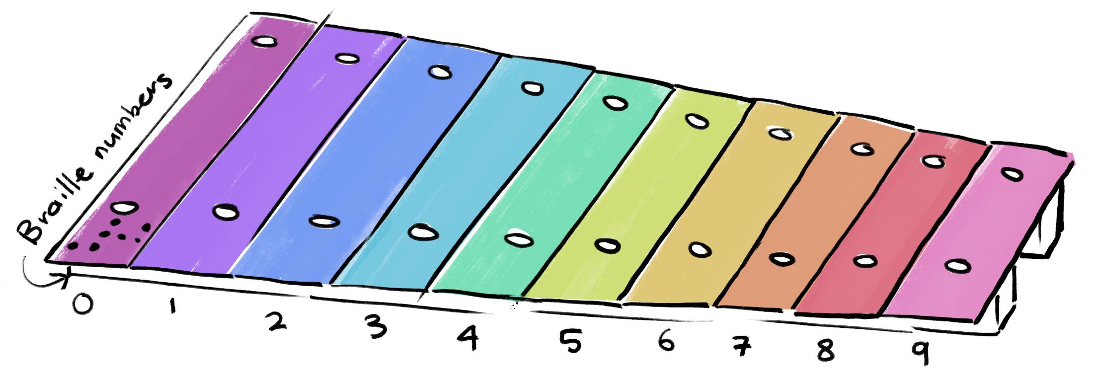
The initial sketch was a rainbow instrument resembling a xylophone, that represented the numbers 0 to 9. Users essentially could use it as a key pad. The keys themselves were conductive and each had a non conductive section where braille was placed, so users could touch it without registering input. This structure slowly changed throughout the design process according to feedback and user research. Online research and personal testimonials from visually impaired people were analysed to evaluate what essential elements needed to be considered first and foremost. The first consideration was the colour to distinguish the keys. With a primary focus on visually impaired children, I spent far too much attention on the visual aesthetics of the form, thus the concept of colour was scrapped to focus on the main functionality and physical touch and audio. The form shifted from resembling a xylophone to resembling a piano, as research showed visually impaired students were best able to learn piano and guitar due to the physical and natural form of the instruments. The keys were created to come down when pressed. The original form was made quickly with the thought of trashing it, thus there were a few errors but it achieved the intended purpose. As it imitated the feeling of a piano with a key being pressed down. Next, the braille was removed, with the consideration of physical cues that computer keyboards have on the ‘f’ and ‘j’ keys. This stage of prototyping received feedback from peers about how it was essentially just a piano. Those around me believed more could be done with consideration of the initial concept, learning with music, thus I explored other forms for the physical structure.
Second Phase
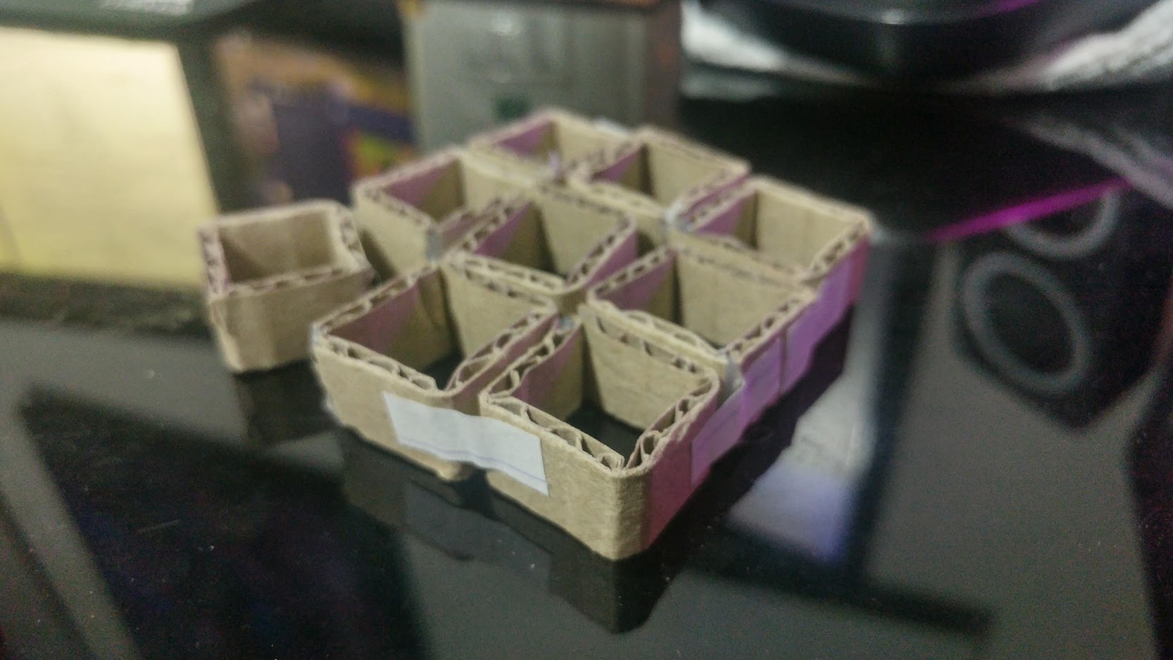
The second phase of design encountered many sketches, and a revision of the entire concept. It went through significant changes in the structure and core functionality. The structure was initially proposed as a chain-link of cubes, that could be spiraled and transported easily, and also adjusted to suit the needs of the user. Again, this strayed away from the concept and was looking further at usability of the physical prototype, and didn’t consider the logistics of the circuit wiring. Thus, the idea was scrapped after a miniature prototype.
Final Design
The third phase was the fully revised design, with limited numbers, and inclusion of the numerical operators. The form almost resembles
bongo drums, which goes along with my evident obsession with creating bootleg musical instruments. My hypothesis is that musical instruments
have been designed for the comfort of those playing them. The final design returned to the original braille concept, and had buttons that only
registered input when presse down (as it completes the conductive circuit). The numbers and operators were also placed on each key for those who
are not visually impaired, and also for ease of external users to understand if they do not recognise braille. The numbers were cut out of
copper tape to ensure they did not interfere with the conductivity when the user interacts with the buttons.
The build is also significantly bulkier than the initial prototype, due to it containing the circuitry within it. It has also been constructed
with loose components for ease of demonstration, and the ideal build would be just a bit more secure.
Core Functionality
The process began with setting up a single capacitive touch sensor and LED to ensure the circuit was achieving the intended purpose.
Once I was satisfied the sensor was working , I moved onto the next stage where I added more capacitive touch sensors This stage encountered
quite a few issues and multiple variations had to be tested out, before settling on the current design.
Originally the prototype was going to have 10 keys, numbered 0 to 9, however since it was still the prototyping stage, the circuit only had
8 capacitive touch sensors to begin with. 3.3 megohm resistors were used to increase sensitivity, with the additional use of copper tape and
foil, especially as the pins themselves would not be easy to touch.
The Unity and Arduino code was rather simple, and only changed slightly between the first and final physical build stages. While it was
originally used to input numbers 0-7 (0-9 was intended but not achieved), and the final iteration contains limited numebrs 0, 1, 2, 3, 5, and the basic
mathematical operators to get users to think critically when calculating equations.